Tuesday, August 25, 2009...2:11 pm
Critique of the Online Journalism Blog's new look
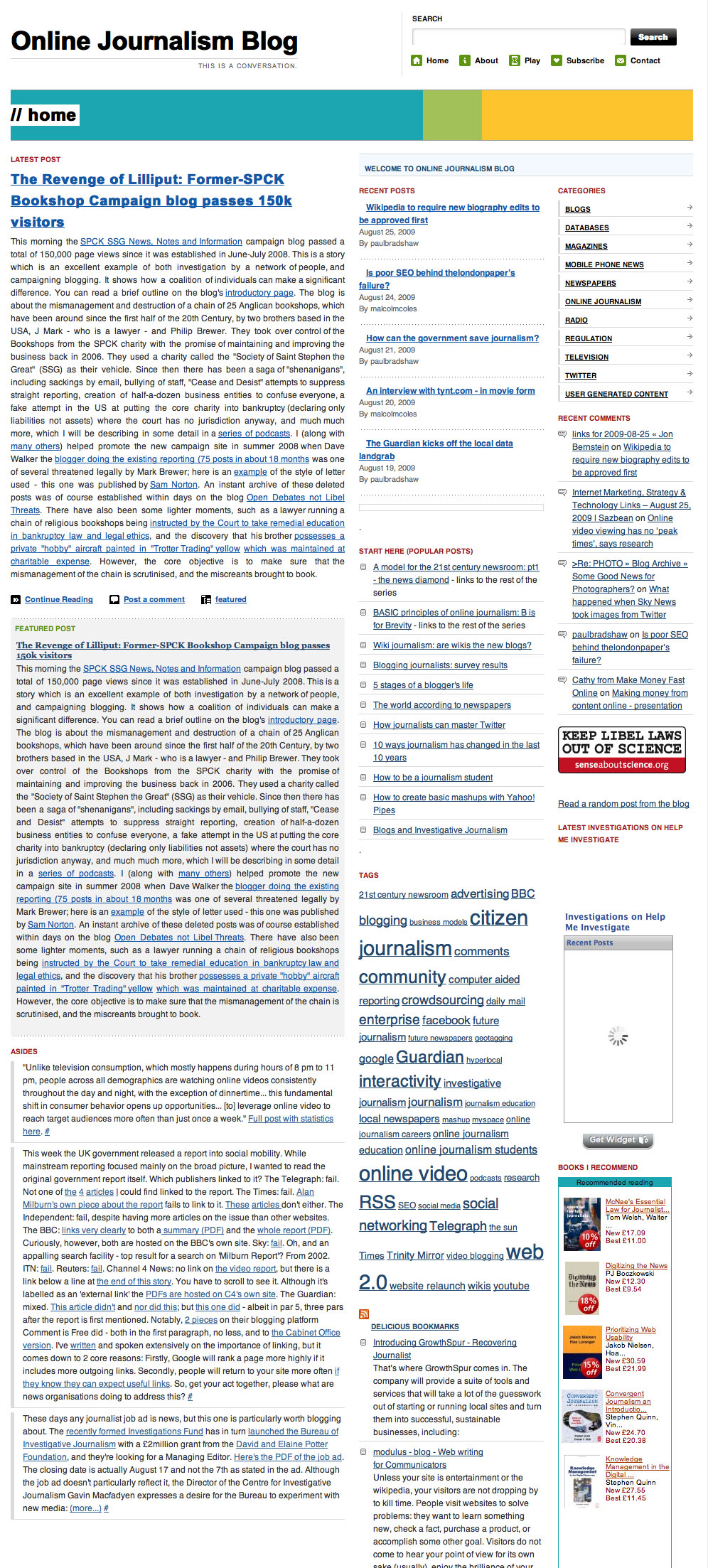
 Being as I’ve been too busy checking, unchecking and then rechecking tick boxes on a CMS for the past few weeks, I’ve only just caught up with the redesign of Paul Bradshaw’s Online Journalism Blog.
The OJB is excellent as a resource, but it used to look dreadful – tiny type, an unattractive colour scheme and confusing post attribution, so you never knew who’d written what. It was also jam-packed with links, tabs and sections, so navigation could be a bit confusing.
So a redesign is good news. The bad news is that that the new design really hammers the blog’s usability.
For a start, the blog has suddenly closed off its archive. I mean, it’s still there, but you can’t browse it by date. The home page only displays the latest post, and only displays the previous 5 posts in a “Recent Posts” section in the sidebar.
Now, I don’t know about you, but I like to flick back through a blog’s content chronologically for a while if I see something I like to see what else is up. The OJB has stopped this, and also has no calendar-based archive link, so you could look at June’s posts at a glance, say. A big, big failing.
Other issues:
- Typography – justified with no hyphenation, so there’s a lot of distractingly gappy text
- Categories – navigation is much more category-based, with a prominent list in the sidebar. But you can’t see which categories have been assigned to a post just by looking at it. I don’t know why, but this bothers me. I think it must be because I am spending too much of my time with taxonomy at the moment. I’d like a more transparent taxonomy in the sites I visit, I guess.
- Attribution – authorship is much clearer when you get past the home page, but not on the “Latest post” which is the most prominent on the site, strangely.
- Clickthrough – the Latest Post is long enough that you might miss clicking through (like I did), because it seems complete in itself. I’d prefer to see the whole of the post on the front page, with images, or else an obvious excerpt. And with excerpts, I’d prefer to see more of them. Although I’d prefer the whole thing.
- Repetition – for some reason the Latest Post is published twice on the home page: once as a normal-looking post, the next as a box-out underneath it. I’m thinking (and hoping) it’s a weird programming glitch that will be sorted out.
- Signposting – I’m often not sure where I am or what I’m looking at. Underneath the Latest Post on the home page, for example are several items under the heading “Asides” that look like comments, but in fact turn out to be other posts. Confusingly, some are from the OJB, some aren’t. This may be a deliberate element of the OJB’s “This is a conversation” strategy, which is fine, but the fact that I had to look twice to realise they were separate stories instead of comments or something else, is less fine. They also don’t have headlines. They need headlines. And the clickthrough link is a bit weak. More clarity please!
Verdict: ultimately, the redesign gives the impression that there’s much less on the Online Journalism Blog than there was before. And makes it less easy to access. Just my tuppennyworth…
Tweet
3 Comments
August 26th, 2009 at 7:04 am
It’s a good site, but, from a design point of view it’s clearly not a showcase for online media.
My big problem is the main text sits in a tight, wide, justified column while the bigger and bold type to the right catches the eye. This makes it hard to read the body text. All that blue underlining doesn’t help.
August 26th, 2009 at 7:05 am
Oops… meant to say, It’s much easier to read the RSS feed on Bloglines.
August 28th, 2009 at 1:14 am
Full of good advice, but graphically, it is a mess.
Leave a Reply